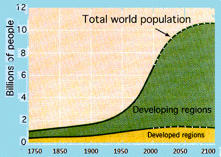
The line chart demonstrates the growth of population in rich and poor countries world-wide between 1750 and 2150 in billions. In fact it’s not real but estimates by the UN and the Population Reference Bureau.
As can be seen, the figure of population is increasing slightly in the more developed countries; whereas the poor countries are rising dramatically from 1950 to 2150. According to the chart there was a gradual increase in both richer and poorer countries from 1750 to 1950 but the less developed countries almost tripled in population to approximately one billion. From 1950 to 2001 there was a sharp increase from about 2 billion to 6.1 billion.
In conclusion, the main trend will be for richer countries to remain constant but for less developed counties to rise dramatically. In my opinion I would say that I totally agree with this estimation graph.
No comments:
Post a Comment